 11-10-2022
Perhaps no other profession relies on signage as much as realtors rely on real estate signs. And that means no other business is more affected by poor sign design.
But the team at Houston Graphic Signs is here to help.
Read on to learn 3 of the most common mistakes we see in local real estate sign systems, or call (713)-244-8704 to speak directly with a real estate sign specialist near you.
One real estate sign is always better than none. But when you’re trying to get people interested in your listing or open house event, real estate sign systems work best, allowing you to:
At Houston Graphic Signs, creating real estate sign systems is easy. We offer a large selection of real estate sign products, including:
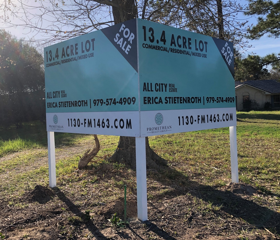
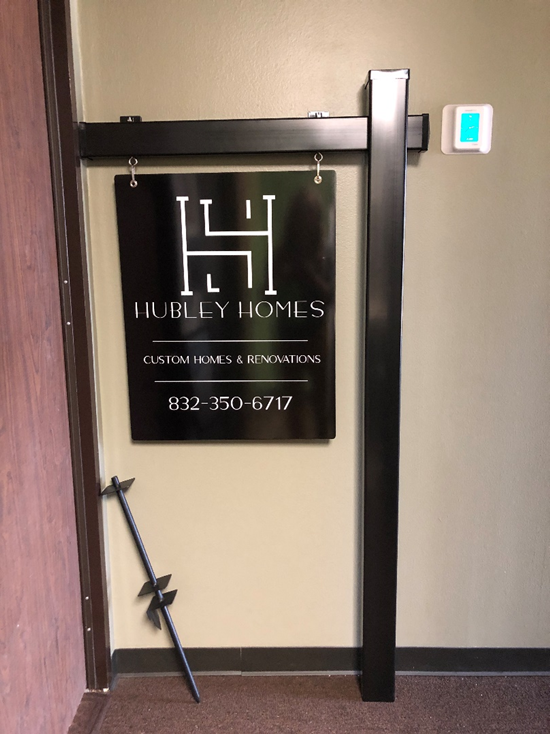
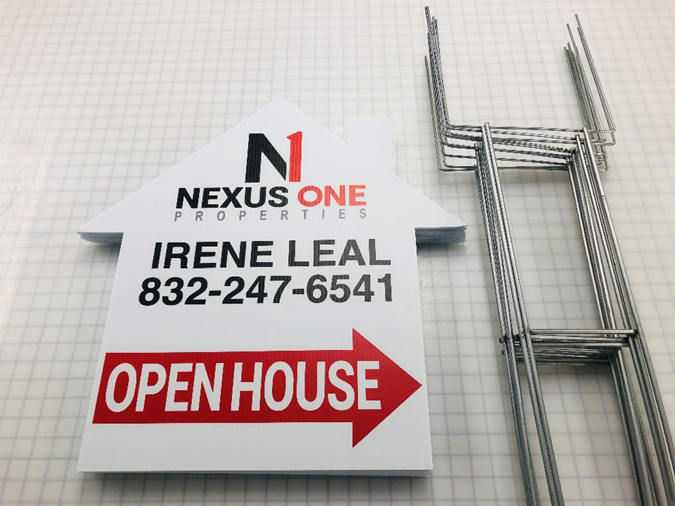
And no matter what you choose, you’ll enjoy complete creative freedom, color matches, and the full support of our in-house design team.
The majority of real estate signs are read by passing drivers, so their messages need to be sized accordingly.
Research by the International Sign Association (ISA) suggests making letters one inch (1”) tall for every twenty-five feet (25’) of distance your sign is from the road. This letter size makes your message legible to drivers traveling at city speed limits.
Adhering to these letter size requirements will give you less room to write (unless you select a larger sign as your canvas), but that’s not necessarily a bad thing. Most drivers do not have the opportunity to read long, detailed sign copy while on the move—it’s just not safe. For this reason, most roadside messaging is concise, written to be read in a single glance.
Here again, we see the value of using a complete sign system over a single real estate sign. You can use big fonts and punchy messaging to engage passing drivers and save the info-rich signs for pedestrians and open house attendees who want to learn more.
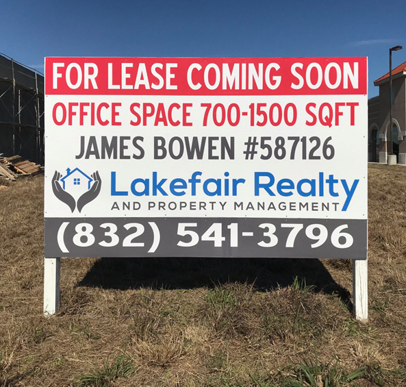
According to research by the Interdisciplinary Journal of Signage and Wayfinding, “the contrast between a sign and its immediate background is the primary determinant of one’s ability to detect the sign… perhaps more than size” (Bullough, 2017, p. 21).
Insufficient contrast is a leading cause of poor real estate sign performance, but it’s an easy fix. With our selection of real estate sign colors, materials, and finishes at your fingertips, and the guidance of our in-house experts, you’ll have no trouble cranking up the contrast on any design.
Take this commercial real estate sign for instance. Using only 4 colors, we created 5 different high-contrast combinations—white-on-red, red-on-white, black-on-white, blue-on-white, and white-on-black:
The team at Houston Graphic Signs has helped numerous realtors, commercial agents, and independent sellers generate more leads, offers, and sales commissions with quality real estate sign systems, and we can do the same for you.
To get a free quote on any custom real estate sign order, you can: