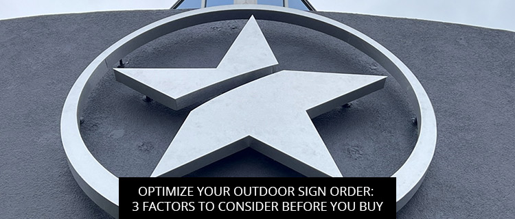
 01-03-2023
If you want your outdoor signs to make the biggest possible impact—and generate the highest possible returns—you’ll need to think ahead. As the old saying goes, failing to plan is planning to fail. But you don’t have to do it alone.
To help you optimize your next outdoor sign order, today’s post shares 3 critical factors every business should factor into their design and site selection plan.
Read on to learn more, or call (713)-244-8704 to get a free quote on a custom outdoor sign design from our team in Houston, TX.
With the right design and site selection, your silent salespeople will keep working hard in any weather, improving wayfinding, generating impressions, and boosting brand authority come rain or shine.
But if you want them to keep looking their best and last long enough to generate a big return on your investment, you need to select materials that can stand up to the elements.
When ordering online, this requires a lot of extra effort from the “end user” (that’s you!). While you may know your local weather patterns quite well, you may not be so familiar with all of the different sign materials available to you.
Rather than wasting productive work hours researching different options, many Houston business owners prefer to ask our team for help. We carry a wide range of weather-resistant and weatherproof materials, such as:
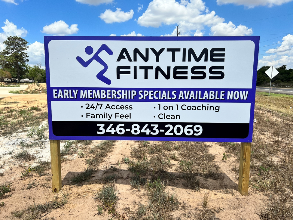
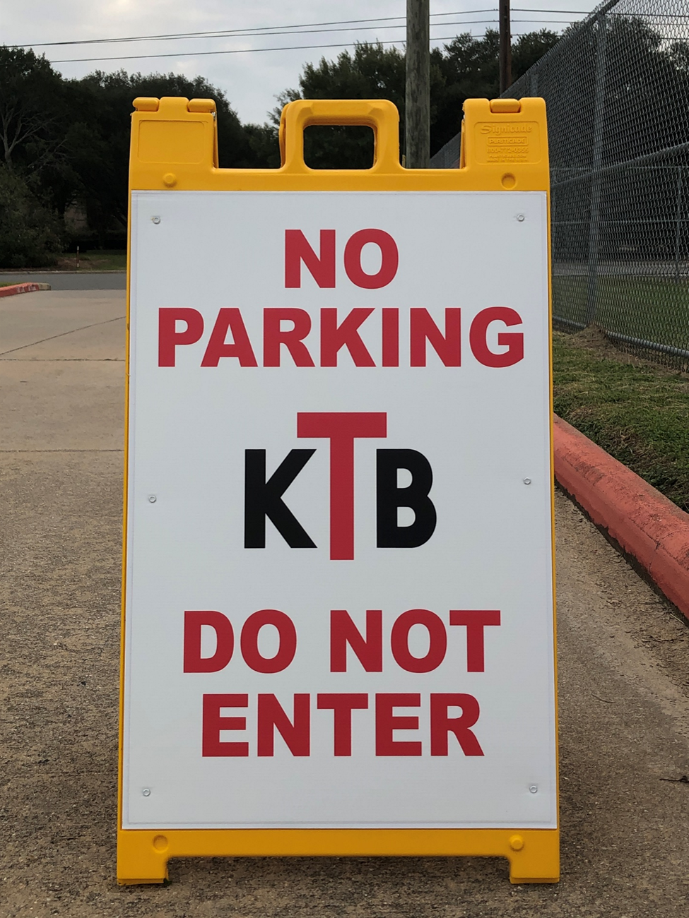
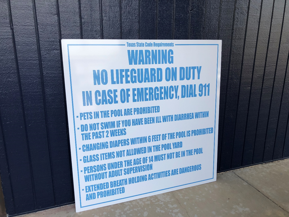
These are just a few of our weather-resistant materials. For personalized recommendations and help reducing exposure with smart site selection, get in touch with our outdoor sign experts.
If you want to maximize your sign visibility, you need to identify your target audience and cover their angles of approach.
Ideally, you want to place your sign directly in front of your audience, in the middle of their field of view. If this isn’t possible, either because it is unsafe or because it disrupts the flow of traffic, try to place your signs perpendicular to the road or sidewalk where your audience is traveling. This will give approaching audiences enough time to spot, read, and act on your message, whereas parallel set-ups flash them a quick glimpse as they walk or drive by.
In fact, in one study by the International Sign Association (ISA), outdoor signs mounted parallel to the road needed to be 70% larger than signs mounted at perpendicular angles to achieve the same legibility.
When mounting signs at perpendicular angles, hanging signs work particularly well, since they do not block traffic and they can be designed double-sided.
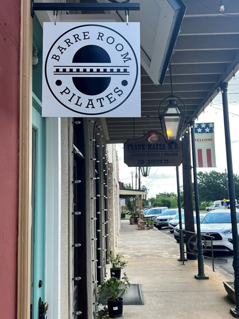
Think carefully about your audience’s angle of approach and try to mount them perpendicular to the road or sidewalk.
If you’re looking for more reusable/repositionable or budget-friendly options to supplement your existing sign system, yard signs and A-frames work great, too!
In the past, we’ve discussed how internal contrast (i.e. contrast between your sign’s font and background) makes your signage more conspicuous. But creating external contrast is equally important to make sure your sign stands out from its surroundings and competitors.
For example, if your competitor is using a square-shaped black-and-white sign, taking your design in the same direction would be a mistake. Sure, black-on-white is a notoriously conspicuous color combination, but it won’t serve you here. At best, your signs lose out on the marketing magic of novel design; at worst, they get overlooked entirely.
For example, take a closer look at the hanging sign for Barre Room Pilates featured above. Three different signs are visible in that picture, and they are all very different, with unique shapes, materials, display heights, colors, and fonts. This is by design.
Even if you happen to share the same brand palette as your neighbors, we can help you create a distinct display with unique shapes, finishes, illumination, and dimensional design.

We recently installed this 50” dimensional back-lit logo at Powerhouse Church in Katy
To learn more about effective outdoor sign design practices and get a free quote on your order, you can: