
 12-28-2022
If you suspect your window graphics aren’t performing up to their full potential, or you’re about to begin the design and site selection process for your first order, today’s post is for you!
Read on to review the research and learn 4 simple things you can do to make your window graphics stand out, or call (713)-244-8704 to speak directly with a window graphics specialist in Houston, TX.
Wordy, info-rich signs can be appropriate in some cases, like when customers want to learn more about products with minimal packaging, but window graphics are rarely used in this context.
Window graphics are primarily used for branding, basic wayfinding, and striking the interests of passersby, all of which can be done with just a single image or a few words. Furthermore, most of your readers will be on the move, and they’ll only have a few seconds to read, internalize, and act on your message before they continue on their merry way.
Accordingly, if you want your message to stand out and get read, strive for simple and striking designs with no more than 2-4 lines of text and 1-2 images.
“Less is more” can be a hardsell for some, but plenty of research bears out the value of that old design adage. For example:
If you need help pairing your message or design down to the most impactful parts, our window graphic team can help.
Most people aren’t scanning their surroundings for signage outside of wayfinding contexts, so if you want your business messaging to be read, you need to make it effortless by placing your window graphics in your audience’s field of view. This usually means placing them at eye-level, since most of your audience will be very close to your messaging. However, if you are advertising to passing drivers or using big window graphics intended to be viewed from a distance, you’ll have a bit more leeway.
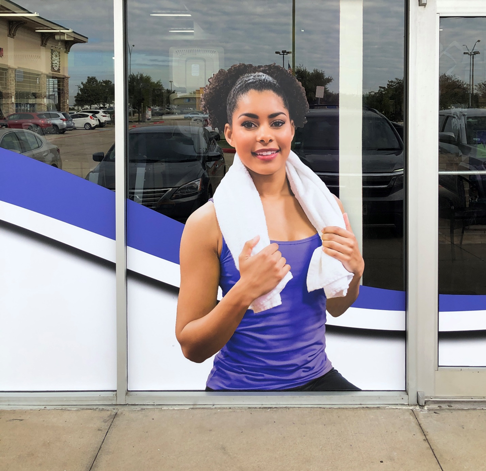
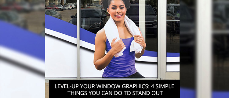
Stop by and visit ANYTIME FITNESS on Pin Oak Road in Katy,
we recently updated all of their window graphics!
Window graphics come in all sorts of different finishes, from shimmering metallics to eye-catching frosted effects, which simulate the appearance of etched glass.
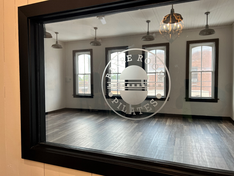
Check out this frosted finish we completed for Barre Room Pilates!
Incorporating one of these finishes into your window graphics can greatly increase your visibility without drastically changing your design. For example, one study by Color Research & Application noted how metallic finishes create “a unique appearance of glossiness,” which creates conspicuous contrast and reflections that make your window graphics “very attractive to humans” (Tanaka & Horiuchi, 2018, p. 697).
To explore our full selection of window graphic finishes, get in touch with our team!
The best designers spend extra time arranging textual and graphic elements to show readers their order of importance. This technique, which is known as “creating a visual hierarchy,” improves your window graphics’ scannability, which makes them more inviting to onlookers and ensures your main message comes through.
Along with prominent positioning, you can make your main message stand out by:
Call (713)-244-8704 or fill out our online contact form to speak with our team and get a quote on any order in Houston, TX.
References
Bullough, J. (2017). Factors affecting sign visibility, conspicuity, and legibility: Review and annotated bibliography. Interdisciplinary Journal of Signage and Wayfinding, 1(2), 2-25.
Eytam, E., Tractinsky, N., & Lowengart, O. (2017). The paradox of simplicity: Effects of role on the preference and choice of product visual simplicity level. International Journal of Human-Computer Studies, 105, 43-55.
Knuth, M., Behe, B. K., & Huddleston, P. T. (2020). Simple or complex? Consumer response to display signs. Interdisciplinary Journal of Signage and Wayfinding, 4(2), 7-22.
Orth, U. R., & Crouch, R. C. (2014). Is beauty in the aisles of the retailer? Package processing in visually complex contexts. Journal of Retailing, 90(4), 524-537.
Park, L. O., Manning, R. E., Marion, J. L., Lawson, S. R., & Jacobi, C. (2008). Managing visitor impacts in parks: A multi-method study of the effectiveness of alternative management practices. Journal of Park & Recreation Administration, 26(1).
Tanaka, M., & Horiuchi, T. (2018). Investigation of metallic color perception using real‐world materials. Color Research & Application, 43(5), 697-712.
BACK