 02-21-2023
Lobby signage is not just for decoration; it also helps with wayfinding and works as an “inferential cue” for your customers, communicating your brand’s quality and character without words, all in the blink of an eye.
This is borne out by several studies. For example:
If you’re looking for help designing lobby signage that fosters better brand impressions, look no further. Today’s post reviews research by the Journal of Advertising Research highlighting 4 simple lobby sign design tweaks you can use to impress your guests.

Read on to learn more, or call (713)-244-8704 to put these best practices to work with a lobby signage specialist in Houston, TX.
In a seminal branding study, researchers Van Meurs & Aristoff (2009) sought to identify design factors associated with speedy brand recognition and quality impressions.
To that end, they used a tachistoscope, a kind of slide projected device equipped with a mechanical shutter system, to give participants very short glimpses of lobby sign designs. This device allowed the team to measure the time it takes for a brand to be recognized. Once the results were in, qualitative interviews with participants were used to assess the quality of the brand impressions left by the lobby signage.
Analyzing the results of their experiments, Van Meurs & Aristoff identified the following four common factors among all top-performing lobby signage:
1. The best lobby signage contains low informational loads. Lobby signage laden with information about the product, service, or company tended to perform poorly in measures of brand recognition and impression quality. Even lengthy slogans had negative impacts.
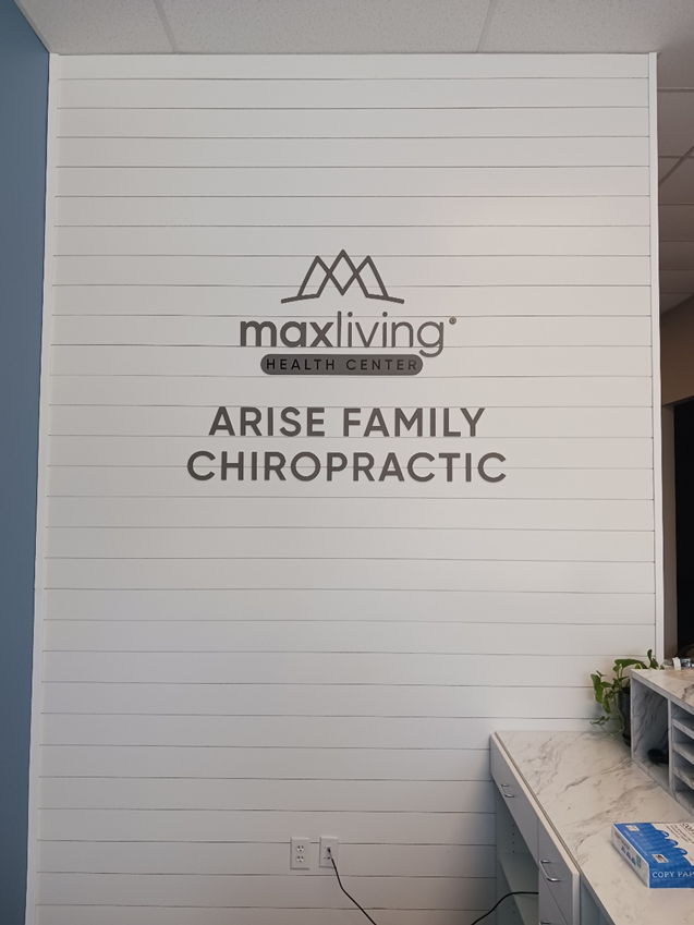
In conclusion, a simple brand name and logo is all you need to catch eyes and make a good impression. Product, service, and company information is important, but it is best left for your informational signs, product displays, or your salespeople/staff to communicate.
2. The best lobby signage included large, centrally placed logos. “Logos enhance the speed of brand recognition, unless they are placed in the bottom right corner,” states Van Meurs & Aristoff (2009). Brand recognition, recall, and impression quality was also positively influenced by the size of the logo, with the greatest impact seen when the logo occupied “at least one-third of the available space” (p. 85).
3. The best lobby signage uses the right fonts. Overly ornate, complicated, or artistic fonts were linked to lower brand recognition speed and quality ratings, presumably because the reader struggled with, and was left somewhat frustrated by, the hard-to-read text. Accordingly, for best results, stick to something highly legible, and avoid outline fonts unless you’re willing to go big—compared to solid fonts, outline fonts need to be 1.8x as large to achieve equivalent legibility.
4. The best lobby signage leverages color psychology. The right colors can “evoke images, ideas, and feelings” about your brand, which makes it much easier to make lasting impressions and convey meaning without words (Van Meurs & Aristoff, 2009, p. 85). But beware: using too many colors “may create clutter that leads to consumer confusion” (p. 86). For help selecting the right colors to represent your brand, and avoid overcrowding your palette, get in touch with our lobby signage experts!
To speak with our lobby signage experts and get a free quote on any custom order, you can:
References
Kellaris, J. J., & Machleit, K. A. (2016). Signage as marketing communication: A conceptual model and research propositions. Interdisciplinary Journal of Signage and Wayfinding, 1(1).
Oh, H., & Petrie, J. (2012). How do storefront window displays influence entering decisions of clothing stores? Journal of Retailing and Consumer Services, 19(1), 27-35.
Van Meurs, L., & Aristoff, M. (2009). Split-second recognition: What makes outdoor advertising work? Journal of Advertising Research, 49(1), 82-92.
BACK