
 10-21-2024
Creating an effective custom sign goes beyond just picking a logo and placing it on a board. Two essential elements—color and typography—play a significant role in shaping how your sign communicates with your audience. Thoughtful use of these design aspects can elevate your brand and ensure that your message is not only seen but also remembered.
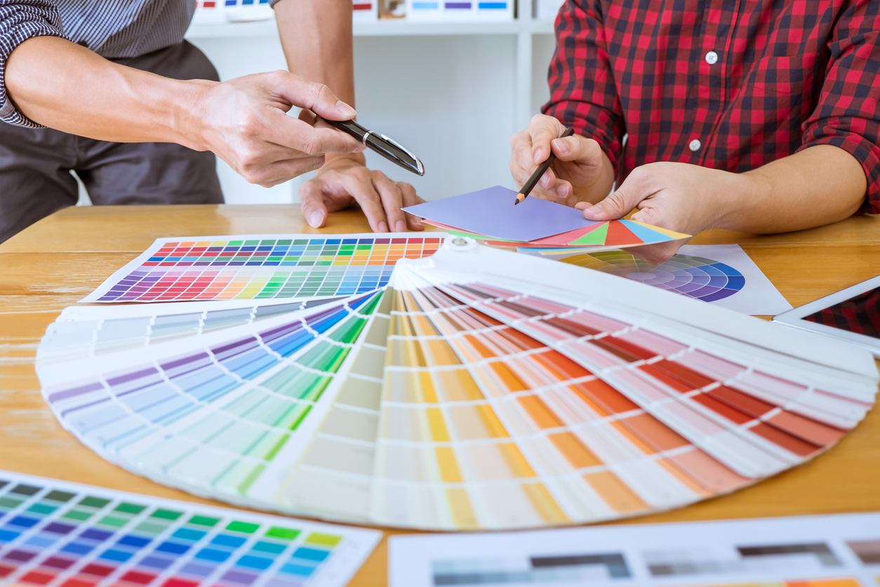
Color is one of the most powerful tools in custom sign design. Different colors evoke different emotions and can be used strategically to influence how people perceive your brand. For example, red often conveys energy, urgency, or passion, while blue can invoke trust and professionalism. Choosing the right color scheme for your sign can create a strong connection between your business and its target audience. Colors should also be selected based on their visibility. High-contrast color combinations, like black and white or yellow and blue, make signs easier to read from a distance, which is especially important for outdoor signs or signs placed in busy areas.
Typography is equally important in custom sign design. The font you choose for your sign can communicate professionalism, creativity, or even luxury, depending on its style. A clean, sans-serif font might be ideal for a modern tech company, while a script font could add a touch of elegance for a high-end boutique. It’s also crucial to consider legibility when selecting fonts. A beautifully designed sign won’t serve its purpose if the text is difficult to read, especially from afar. Typography should be clear and well-spaced, ensuring that your message comes across effortlessly.
The interaction between color and typography is another key consideration. A bright, bold font in a complementary color can draw attention and make a strong statement. However, using too many colors or fonts can overwhelm the design and dilute the message. The goal is to find the perfect balance where both the colors and typography work in harmony to convey your brand’s identity and message.
Another factor to keep in mind is the emotional response both color and typography can elicit. Combining bold colors with dynamic fonts can create a sense of excitement and urgency, ideal for sales or promotional events. On the other hand, softer tones and more subdued typography can create a calming, welcoming atmosphere, perfect for businesses like spas or wellness centers.
Houston Graphic Signs specializes in creating custom signs that effectively leverage color and typography to communicate your brand’s message with impact. With a total branding approach, their team of designers works closely with clients to ensure every sign is crafted with precision, clarity, and lasting visual appeal. Houston Graphic Signs provides the expertise needed to bring your vision to life, using cutting-edge technology and high-quality materials to produce signs that stand out and make a lasting impression.
BACK