 01-21-2025
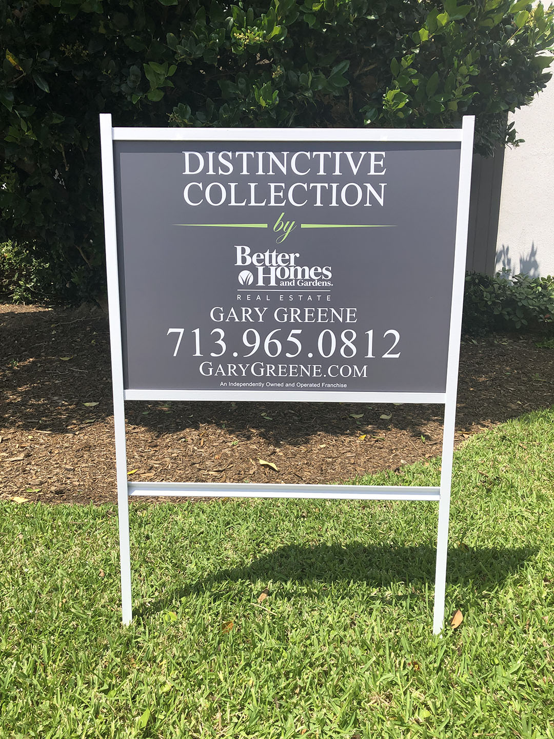
Realtor signs are more than just directional tools—they are an extension of the agent’s professionalism and the property they represent. Text on these signs must be clear, concise, and easy to read from a distance. Clarity in messaging immediately builds trust with potential buyers, ensuring that they know exactly who to contact and what property is being advertised. Overloading a sign with too much information or using small, hard-to-read fonts can diminish its effectiveness, making clarity a priority for every successful design.
Strategic Content Placement Maximizes Visibility
Where text is placed on a realtor sign is just as important as the content itself. Key information, such as the agent’s name, contact number, and website, should be prominently displayed and easily visible from a distance. Supporting details, like property features or additional contact options, can be included but should not overshadow the primary call to action. Strategic placement ensures that viewers quickly find the information they need, even if they are passing by at a glance. A well-organized layout creates an inviting and professional impression while effectively delivering the message.
Brevity Ensures Message Retention
Keeping text content brief is essential for realtor signs to be effective. Long-winded descriptions or excessive details can overwhelm viewers, causing them to lose interest. Instead, concise messaging that highlights the most important details ensures that potential buyers retain the information they need. A simple “For Sale,” “Open House,” or “Coming Soon” paired with essential contact information can be far more impactful than cramming the sign with unnecessary text. Brevity helps to maintain a clean and polished look that aligns with professional branding.
Consistency Reflects Professionalism and Branding
Consistency across all realtor signage not only reinforces branding but also demonstrates professionalism. Fonts, colors, and design elements should align with the agent’s or agency’s overall brand identity. This cohesiveness makes signs more recognizable and memorable to prospective buyers. While creativity is important, straying too far from the established brand can dilute messaging and confuse viewers. A consistent design strategy helps to build familiarity and trust, ensuring that the realtor’s message stands out in a competitive market.
Quality Enhances Longevity and Appeal
The materials and technology used to create realtor signs play a significant role in their effectiveness. High-quality printing ensures text remains sharp and legible, while durable materials help signs withstand weather and time. Investing in well-crafted signs not only enhances their visual appeal but also reflects positively on the realtor’s professionalism. A faded or damaged sign can send the wrong message about the quality of service being offered. Quality craftsmanship ensures that each sign is an asset to the brand, creating a lasting impression on potential buyers and clients.
Houston Graphic Signs combines cutting-edge technology with expert craftsmanship to deliver realtor signs that stand out for all the right reasons. Our team works with you to ensure every detail—from text placement to material quality—aligns with your goals and enhances your branding. Let us help you create signs that speak volumes and drive results for your real estate business.
BACK