 02-28-2023
Even the best commercial signs fall flat without proper site selection, but with the team at Houston Graphic Signs supporting your order, perfect placement is easy to achieve.
Read on to review 5 quick tips for perfect commercial sign placement in Houston, TX, or call (713)-244-8704 to speak directly with a commercial sign specialist near you.

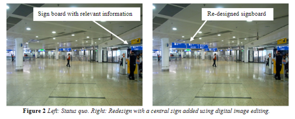
Crowded signscapes are unsightly and ineffective, overwhelming your audience with a wall of text and multiple graphic elements that create a heavy “cognitive burden.” When faced with this kind of cognitive burden, most readers prefer to tune signs out altogether, rather than stopping to decipher every commercial sign cluster they come across.
Sign codes and property lines try to minimize visual clutter, mandating minimum distances between signs, but some business owners still end up overwhelming their audiences with busy commercial sign set-ups. Remember: just as individual signs work best with plenty of “white/negative space,” AKA breathing room, so too does your sign system!
Your commercial sign location might look perfect right now, but make sure to approach your site selection with an all-seasons perspective, and be conscious of peak traffic hours, too.
For example, what looks like the perfect display spot may end up blocked or partially obstructed by foliage from trees in spring, or it could end up mostly blocked by dense crowds of pedestrians during peak hours.
To maximize visibility, commercial signs should generally be placed as close to the street as regulations allow. But be careful about blocking drivers’ sightlines with commercial signs, as this is prohibited by local sign codes.
For example, Section 90-1 of the Conroe Code of Ordinances mandates that roadside commercial signs must be at least 2 feet behind the property line and “out of the visibility triangle at all street and driveway intersections.”
So what is a “visibility triangle,” exactly? It is defined as “a sight triangle at a street interaction formed by the legs of the intersecting curb or edge of pavement lines and a diagonal line between the two legs at points that are 35 feet from the interaction.” It looks like this:
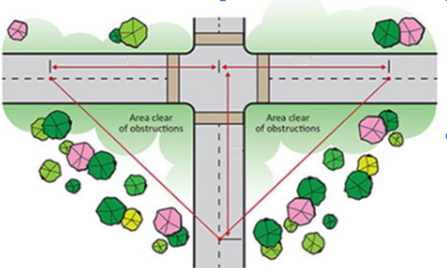
Get your commercial sign as close to the road as possible, but be sure to keep this area clear of obstructions, or you could endanger local drivers and expose your business to fines.
In one study measuring the impact of different sign orientation, researchers found that signs placed perpendicular to roadways consistently outperformed those set up at a parallel angle, even when the latter was 2-3 times as big!
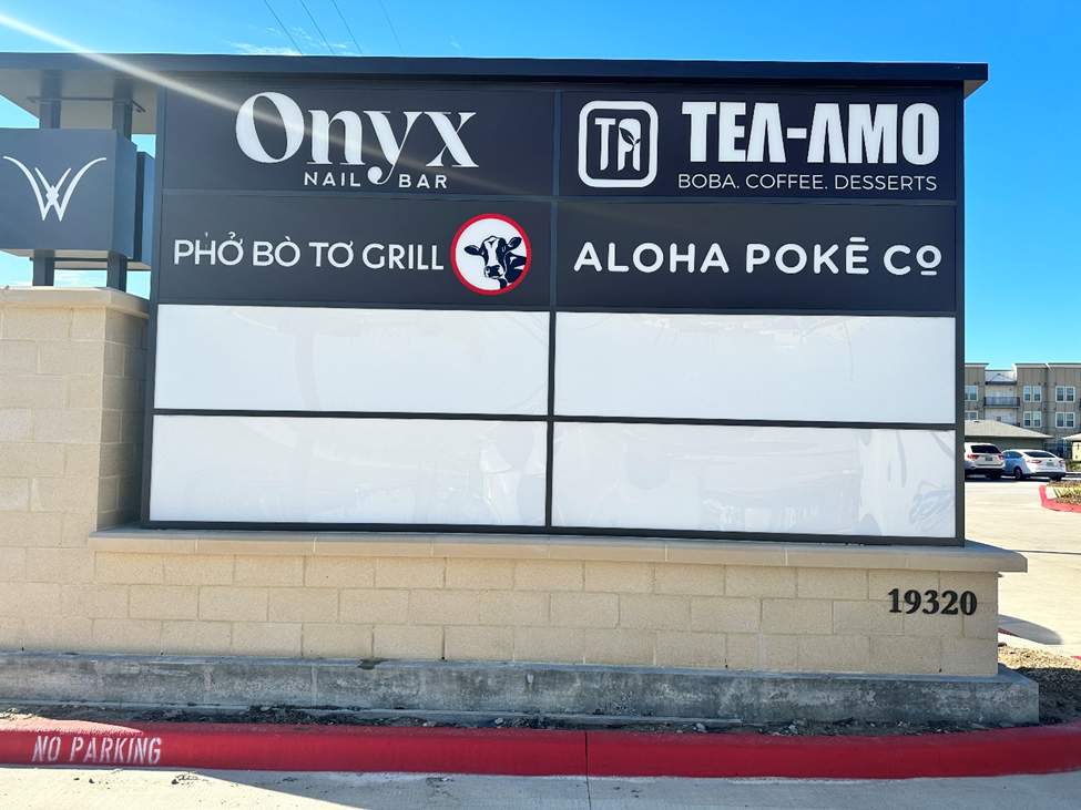
Research in cognitive psychology and environmental psychology gives us some excellent visual guidelines for the design and placement of commercial signs. By comparing gaze behaviors and response times to signs in two different positions, researchers Buechner et al. (2012) found that front-and-center placements worked best.
Here we see the two sign placements being tested. On the left, the “status quo” sign is placed to the upper right of the audience’s field of view. On the right, the right has been repositioned to the front-and-center of their field of view while traveling down this corridor.
These are the results of their eye-tracking experiments, with red indicating long fixation times, yellow indicating moderate fixation times, and green indicating quick glances/short fixation times.
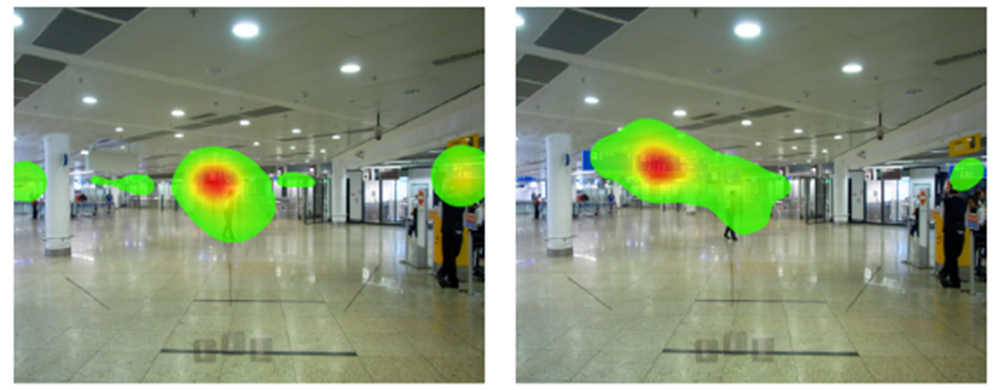
As you can see, in both cases, audiences’ attention was predominantly directed forward, with their gaze fixed to the front-and-center of their field of view. As a result, with the “status quo” sign in the left panel, we see very short fixation times, just a hint of green, whereas the second image on the right shows persistent, red-hot fixation on the front-and-center display.
Clearly, if you want your sign to be read, front-and-center placement is unparalleled. And with our wide selection of hanging, freestanding, and window-mounted signs, that’s easy to achieve.
Houston Graphic Signs is your one-stop shop for commercial sign solutions in Houston, TX, offering a wide selection of commercial sign products under one roof, plus full support with every step of your order, including:
To browse our selection of commercial signs and get a free quote on any custom order, you can:
References
Buechner, S. J., Wiener, J., & Hölscher, C. (2012). Methodological triangulation to assess sign placement. In Proceedings of the Symposium on Eye Tracking Research and Applications (pp. 185-188).
Hong, J., & Isaac, M. (2021). Location, Location, Location: The effect of location on evaluation and aesthetic judgment of off-premise signage. Interdisciplinary Journal of Signage and Wayfinding, 5(1), 26-40.
BACK